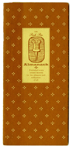
Before Seymour Chwast, Milton Glaser, Ed Sorel, and Reynold Ruffins had fully hammered out the idea for Push Pin Studios, Chwast, Sorel, and Ruffins began publishing the Push Pin Almanack as a vehicle to solicit freelance work while they held day jobs elsewhere. Glaser returned from his Fulbright study in Italy a year later and joined in on the fun. Steven Heller writes in Design Literacy (Allworth Press, 1997):
In 1953 when the first Push Pin Almanack was first published it would have been impossible to predict that its four principal contributors would develop a graphic style that challenged the prevailing ethic of functionalism imported from Europe (during the Bauhaus immigration) practiced by some leading American corporate and advertising designers, and manifest in work by exponents of the Swiss International Style. Yet when that first four-by-nine-inch compilation of facts, ephemera, and trivia illustrated with woodcuts and pen-and-ink drawings was mailed out as a promotion for these freelancers, other New York designers and artists began to take serious notice. Indeed, the Push Pin Almanack brought in so much work from book, advertising, and filmstrip clients that the four Cooper Union classmates decided to leave their day jobs and start Push Pin Studios, the major proponent of illustrative design in America.

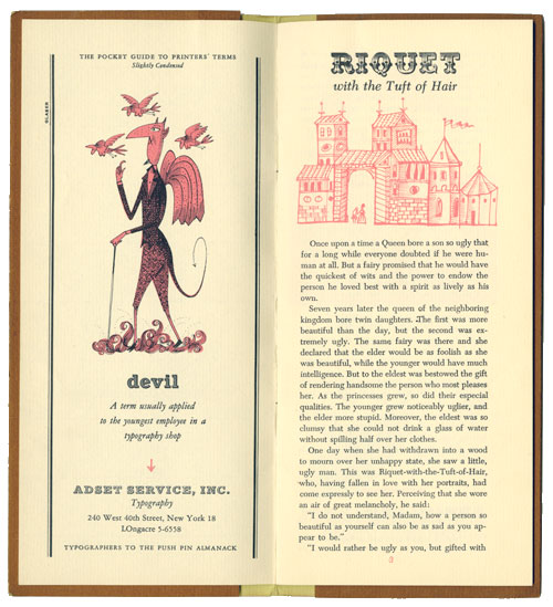
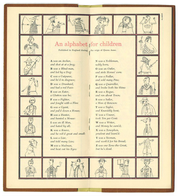
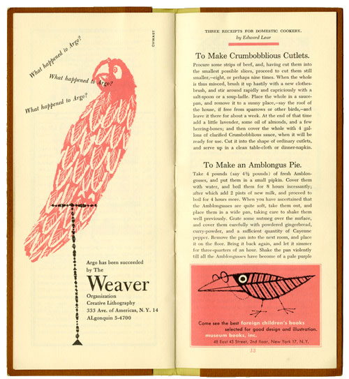
Inspired by the old Farmer’s Almanac, the Almanack had a sweetly humble tongue-in-cheek presentation that belied its ambition. The publication signaled the studio’s complete commitment to concept above all. The Almanack featured here is their “Annual Children’s Issue” (as far as I can tell it was the only one ever published). It’s a tailor-made theme for the artists, and the charming illustrations (including the ones they did for advertisers in exchange for subsidized printing) and whimsical tone draw inspiration from Edward Lear. His “Three Receipts for Domestic Cookery” is reprinted for the intrepid home cook confident enough to attempt an Amblongus Pie:
Take 4 pounds (say 4 1/2 pounds) of fresh Amblongusses, and put them in a small pipkin. Cover them with water, and boil them for 8 hours incessantly; after which add 2 pints of new milk, and proceed to boil for 4 hours more. When you have ascertained that the Amblongusses are quite soft, take them out, and place them in a wide pan, taking care to shake them well previously. Grate some nutmeg over the surface, and cover them carefully with powdered gingerbread, curry-powder, and a sufficient quantity of Cayenne pepper. Remove the pan into the next room, and place it on the floor. Bring it back again, and let it simmer for three-quarters of an hour. Shake the pan violently till all the Amblogusses have become of a pale purple color. Then, having prepared the paste, insert the whole carefully; adding at the same time a small pigeon, 2 slices of beef, 4 cauliflowers, and any number of oysters. Watch patiently til the crust begins to rise, and add a pinch of salt from time to time. Serve up in a clean dish, and throw the whole out the window as fast as possible.
I know what I’m making this weekend.


The Almanack was published until 1956 when it was supplanted by the Push Pin Graphic, which offered studio members the opportunity to radically vary the publication’s concept, look, and format from issue to issue. But Push Pin’s deep intelligence and light touch with abstract ideas had already been established.
This post also appears on our Picturebox blog.
