
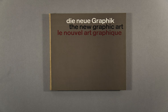
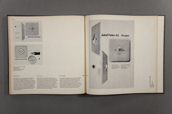
Another of the books recently donated by Ivan Chermayeff was the beautiful slipcased hardcover The new graphic art, a trilingual history detailing the foundations for mid-century Swiss design, compiled by Karl Gerstner and Markus Kutter in 1959 (with translations by Dennis Quibell Stephenson and Paule Meyer). The subtitle holds that it surveys “its origins, its evolution, its peculiarities, its tasks, its problems, its manifestations, and its future prospects.” It’s a big claim but the contents of the book nimbly take on that challenge, essaying such diverse topics as vernacular styles, pure typography, and industrial aesthetics, as well as looking at specific forms like the book cover and catalogue. In the final section they make predictions for the future through the lens of several significant organizations and corporations of the time — including Geigy (the Basel pharmaceuticals firm now incorporated into Novartis), Knoll (the eminent New York furniture producer), Ulm University, and Feller AG (a Swiss electrical fixtures manufacturer).
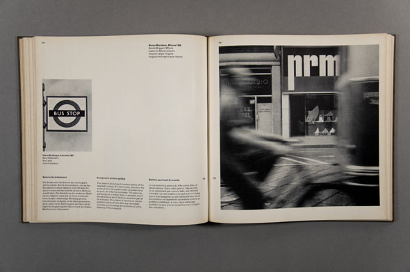
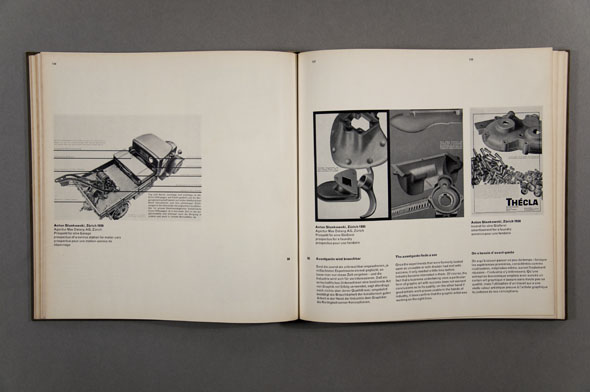
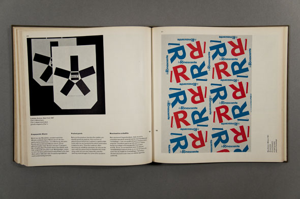
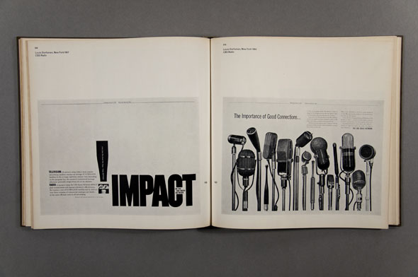
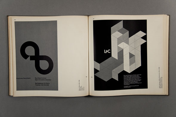
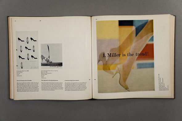
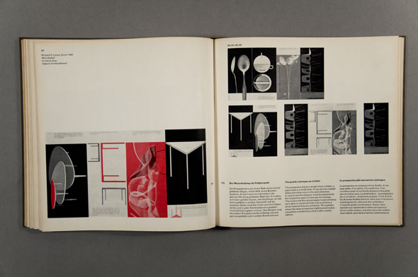
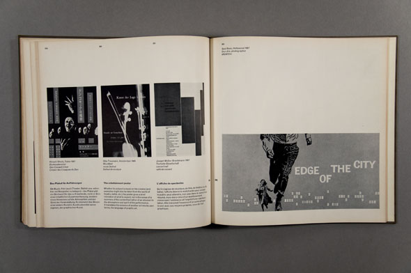
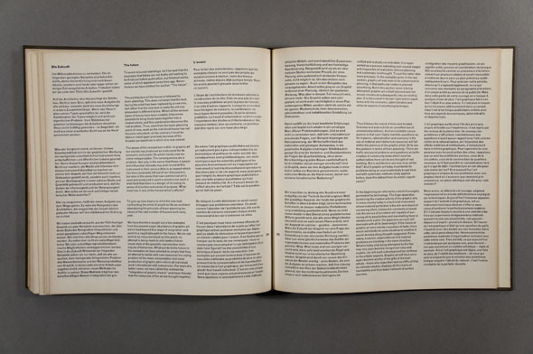
The three-column layout is maintained throughout, but its basic geometry has a confident airiness in its setting and, building on that, it manages to be appealingly pliant. The book’s design echoes that of the magazine Neue grafik and, presumably not coincidentally, the examples chosen by Gerstner/Kutter include a lot of work by that publication’s founders: Richard Paul Lohse, Josef Müller-Brockmann, Hans Neuburg, and Carlo Vivarelli. Click any of the images below for larger versions, via Flickr.
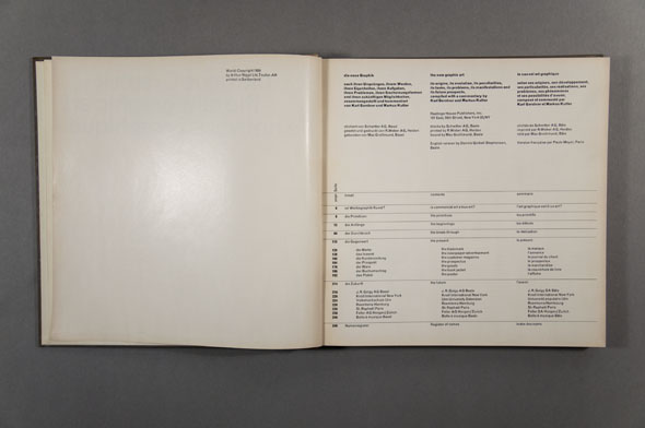
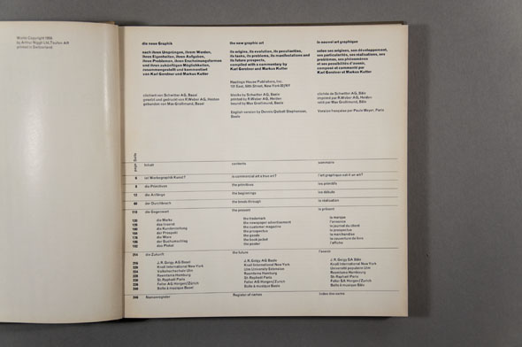
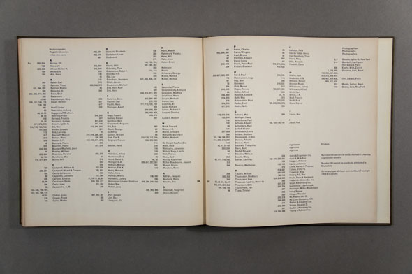
I especially dig the index formatting, which is spanned across the center of each of the columns and is both more readable and more logical than a traditional hanging list.